Taking a vintage stencil and showing that it still has some gimics left in it.
These stencils can be used for everything from body art, to wall murals, to cake decorating and they’re made with a solvent-proof polymer, so you don’t have to worry about what you paint them with because you aren’t going to hurt these babies.
In this 20th instalment of Mastering Skullmaster, I decided to revisit the past using the original Frontal, the first stencil I designed for Artool, and still their biggest seller. It’s not that it’s so spectacular, but it’s just so darn simple, effective and versatile. I’ll use Frontal to render a stretch-face, one of the most requested demos at the Airbrush Getaway workshops. You can use just about any object for this effect, but skulls are among the coolest. The stretched part mimics cloth, goo, slime, etc. that the object it’s pulled over is trying to escape from.
This step-by-step was shot at the October Airbrush Getaway in Las Vegas:
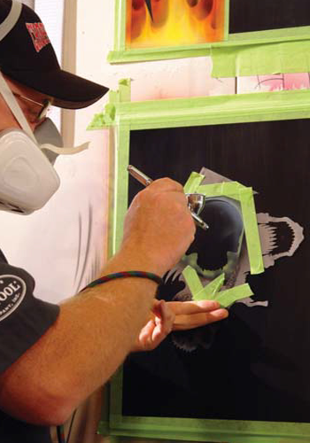 |
| Step 1. Starting with House of Kolor BC-26 basecoat white, I airbrush the basic shape of the skull with the original Skullmaster Frontal stencil. Masking off the areas around the skull itself not only helps reduce overspray, but also helps the stencil to adhere better to the surface.
|
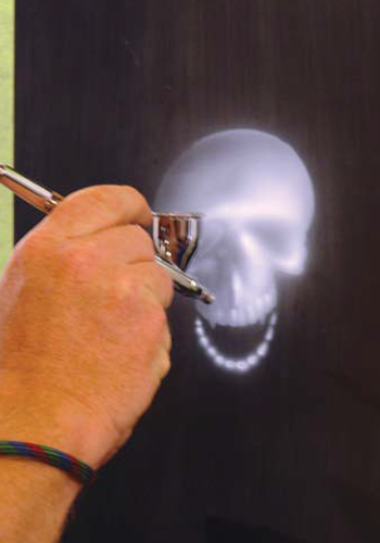 |
| Step 2. After rendering the general highlights of the skull, I add the lower teeth. Whatever you intend to stretch, it must be rendered before you create the furls of the stretch pattern.
|
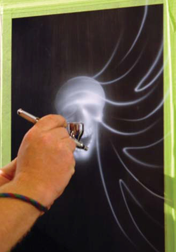 |
| Step 3. With the skull fully rendered, I airbrush the furled lines. Starting from the cheekbones and working around the skull, you want to give the overall design a radial balance with a bit of a random look. I rotate the lines from the skull out, to the border in, and even create a couple that furl back. If you want a good reference, drape a piece of fabric over an object and observe the shadows, contours and folds.
|
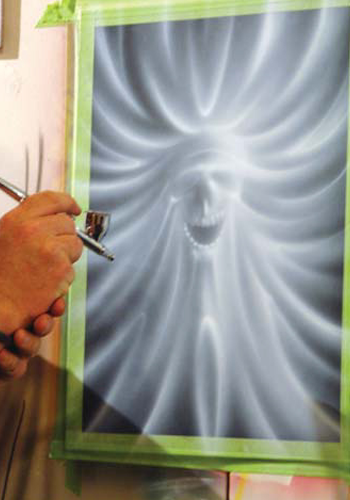 |
| Step 4. Here, you get a better idea of the furled effect and where we’re going with the design. When rendering white over black, you create the highpoints and reflective edges of the furls. The brightest part of the white may be the highlights, but you still need the overspray to give a good background for the black in the next step to play off.
|
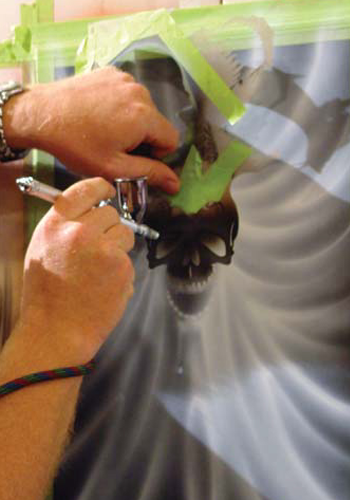 |
| Step 5. With BC-25 black in an Iwata Eclipse CS airbrush and using the same stencil, I spray in the eyes and nose of the skull. The overspray also fills in the gum line on the stencil, allowing me to see where the teeth will be drawn later. |
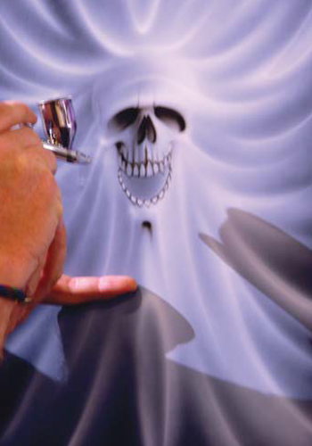 |
| Step 6. I airbrush the black of the skull the same way I applied the white. Adding a few dagger strokes later makes the design look free-handed. Here’s the key: the stencil should only serve to provide continuity to an image, not obviate it. Further, if the technique upstages the image, the artwork fails. |
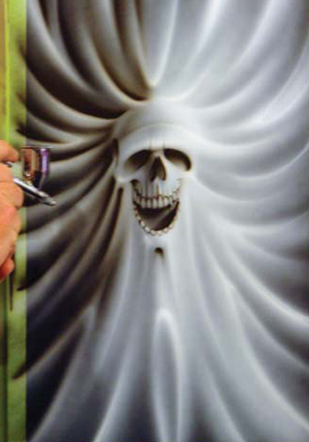 |
| Step 7. Starting from the dark side of the image (the light source is from the upper right), I begin airbrushing in the shadows of the furls, leaving the white highlights behind. The trick to creating depth is to establish a tight edge on the top of the furl and to blend the black away as you fade into the highlight of the following furl. |
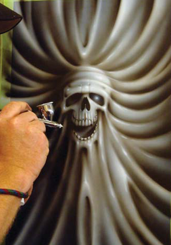 |
| Step 8. Switching back to the original white, I airbrushed a few select highlights — just enough to punch out the design, but not enough to overpower it.
|
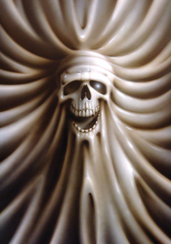 |
| Final Image. |
